26 / Documents
Bounding Boxes
Selectable regions drawn over a page image from normalized coordinates, for showing an agent exactly where an answer came from.
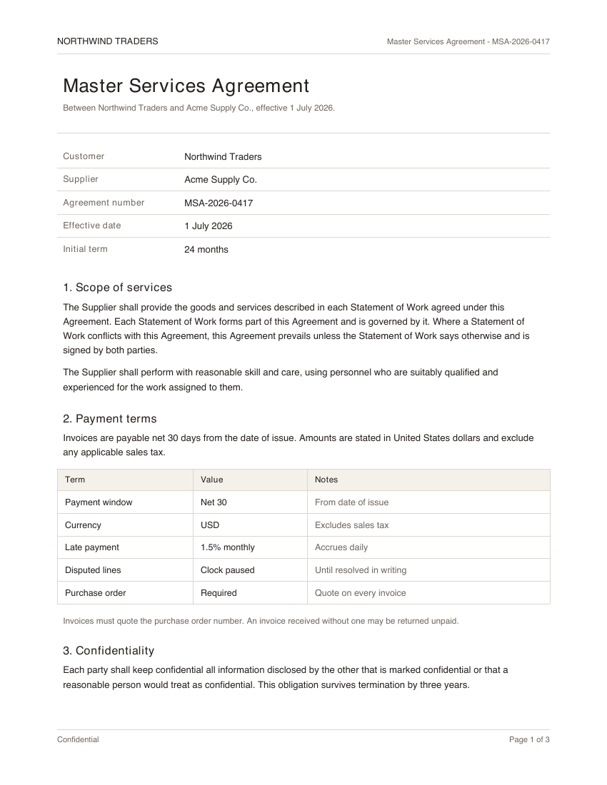
Selected: Payment window
"use client"

import * as React from "react"

import { invoiceBoxes, pageImage } from "@/components/demos/document-fixtures"
import { BoundingBoxes } from "mischief-ui/bounding-boxes"

export function BoundingBoxesDemo() {
  const [active, setActive] = React.useState<string | null>("net30")
  const label = invoiceBoxes.find((box) => box.id === active)?.label

  return (
    <div className="grid w-full max-w-sm gap-3">
      <BoundingBoxes
        alt="Master Services Agreement, page 1"
        boxes={invoiceBoxes}
        src={pageImage}
        activeId={active}
        onActiveChange={setActive}
      />
      <p className="text-muted-foreground text-center text-xs">
        {label ? `Selected: ${label}` : "Select a region on the page."}
      </p>
    </div>
  )
}
Installation
Copy the source into your project, or keep it behind a package.
npx shadcn@latest add Tinkerers-Labs/mischief-ui/bounding-boxesimport { BoundingBoxes } from "mischief-ui/bounding-boxes"Or paste it in yourself. The source imports the shared cn helper from @/lib/utils, so point that at your own copy.
"use client" import * as React from "react"import { cn } from "@/lib/utils" export type BoundingBoxTone = "default" | "accent" | "warning" export type BoundingBox = { id: string label?: string tone?: BoundingBoxTone x: number y: number width: numberUsage
const boxes = [
  { id: "total", label: "Total", x: 0.62, y: 0.71, width: 0.2, height: 0.04 },
]

export function Invoice() {
  return <BoundingBoxes src="/page-1.png" alt="Invoice, page 1" boxes={boxes} />
}
Coordinate system
Boxes are positioned in fractions of the image, not pixels. x and y are the top-left corner, width and height run from there, and every value is between 0 and 1. That is what lets the same box survive the image being resized, zoomed, or rendered at a different density.
// Bottom-right quarter of the image, whatever size it renders at.
const box = { id: "total", x: 0.5, y: 0.5, width: 0.5, height: 0.5 }
Values outside the range are clamped rather than rejected, so a box that runs past an edge is drawn to the edge instead of spilling out of the frame.
Detection models rarely hand you fractions. Divide by the page dimensions the model reported, not by the dimensions you are displaying at.
const boxes = predictions.map((prediction) => ({
  id: prediction.id,
  label: prediction.field,
  x: prediction.left / page.width,
  y: prediction.top / page.height,
  width: prediction.width / page.width,
  height: prediction.height / page.height,
}))Tones
Each box takes a tone, which sets its border and fill. Tone is decoration: the label carries the meaning, so a box never depends on colour to be understood.
| Tone | Reads as |
|---|---|
default | An ordinary extraction. |
accent | Something confirmed, or the field in hand. |
warning | Low confidence, or a value that needs a human. |
API
src, altstringThe page image and its description.boxesBoundingBox[]Id, optional label and tone, and x, y, width, height as fractions of the page from 0 to 1.activeId, defaultActiveIdstring | nullThe selected region, controlled or uncontrolled.onActiveChange(id: string | null) => voidRuns when a region is selected or cleared.showLabelsbooleanShows the label tab above each region.renderImage(props) => ReactNodeUses a framework image component instead of a plain img.BoundingBox
idstringUnique within the set. Drives selection.labelstringShown on the box, and read as its name.tone"default" | "accent" | "warning"Border and fill. Defaults to "default".x, ynumberTop-left corner as a fraction of the image, from 0 to 1.width, heightnumberSize as a fraction of the image, from 0 to 1.Accessibility
Regions are a labelled list of toggle buttons, so they are reachable by keyboard and announced with their label and pressed state rather than only by colour. The visible label is decorative and hidden from assistive technology to avoid reading it twice. Coordinates are clamped to the page, so bad data cannot push a region off the image or out of the document flow.