74 / Blocks
Image Grid
Thumbnails in even cells or masonry columns, with nothing but React behind them.
 Shift Button
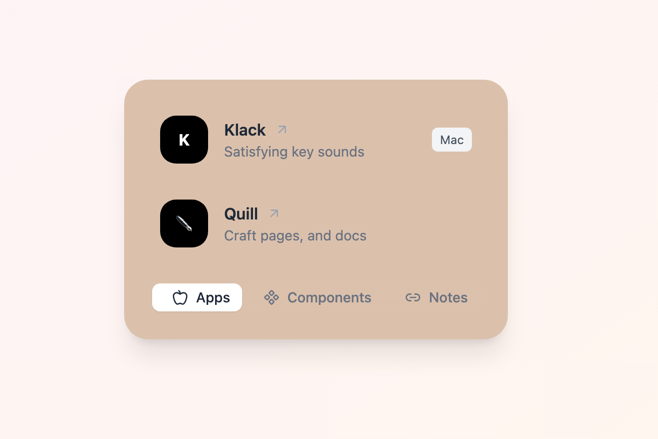 Floating Deck
 Impossible Checkbox
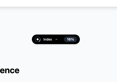 Floating Index
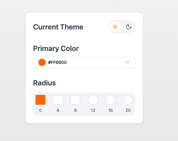 Appearance Control
 Focus Text
"use client"
import { galleryImages } from "@/components/demos/image-gallery-demo"
import { ImageGrid } from "mischief-ui/image-grid"
export function ImageGridDemo() {
return (
<div className="w-full max-w-2xl">
<ImageGrid images={galleryImages.slice(0, 6)} layout="masonry" />
</div>
)
}Installation
Copy the source into your project, or keep it behind a package.
npx shadcn@latest add Tinkerers-Labs/mischief-ui/image-gridimport { ImageGrid } from "mischief-ui/image-grid"Or paste it in yourself. The source imports the shared cn helper from @/lib/utils, so point that at your own copy.
"use client" /* eslint-disable @next/next/no-img-element -- This must work outside Next.js. */ import * as React from "react" import { cn } from "@/lib/utils" export interface GalleryImage { id: string src: string alt: string width?: number height?: numberUsage
export function Shots() {
  return (
    <ImageGrid
      images={shots}
      layout="masonry"
      onSelect={(image) => open(image.id)}
    />
  )
}
A grid, or a set of buttons
Without onSelect the tiles are plain elements: a grid of pictures is not a set of controls, and making it one puts a stop on every image for anyone moving through the page by keyboard. Give it onSelect and each tile becomes a named button, which is what you want when choosing one opens something.
onSelect hands back the event as well as the image, so you can keep the element that was clicked and return focus to it when whatever you opened closes.
const trigger = useRef<HTMLButtonElement>(null)

<ImageGrid
  images={images}
  onSelect={(image, event) => {
    trigger.current = event.currentTarget
    setOpenId(image.id)
  }}
/>
<Lightbox images={images} openId={openId} finalFocus={trigger} onOpenIdChange={setOpenId} />
Grid or masonry
The grid gives every image the same cell, which suits a set that should be compared. Masonry uses CSS columns and lets each keep its own height, which suits a mixed set where cropping would lose something.
Masonry fills one column top to bottom before starting the next, so the reading order runs down rather than across. Where the order carries meaning, use the grid.
API
imagesGalleryImage[]The thumbnails, in order.layout"grid" | "masonry"Even cells, or each image at its own height. Defaults to "grid".onSelect(image, event) => voidMakes every tile a button. Without it the grid is not interactive.renderImage(image: GalleryImage) => ReactNodeReplaces the img, for a framework's image component.emptyStateReactNodeShown in place of the grid when there is nothing.GalleryImage
idstringUnique within the set.srcstringThe image.altstringWhat it shows. Empty only if it is decorative.width, heightnumberIntrinsic size, to reserve space before it loads.captionReactNodeShown over the foot of the tile.descriptionReactNodeLonger text, used by Lightbox.downloadUrlstringOffers the original, used by Lightbox.loading"eager" | "lazy"Defaults to lazy. Eager for the first row.Accessibility
Tiles are only buttons when choosing one does something, so a decorative grid does not fill the tab order. Each button is named for the image it opens. Captions are rendered as text over the image rather than as its accessible name, so alt still describes the picture. Width and height reserve space before the image arrives, which keeps the grid from reflowing under the reader.